§6.8 · Implementation · SwiftUI / Xcode · solo
The strongest proof: I translated the design into a working SwiftUI prototype.
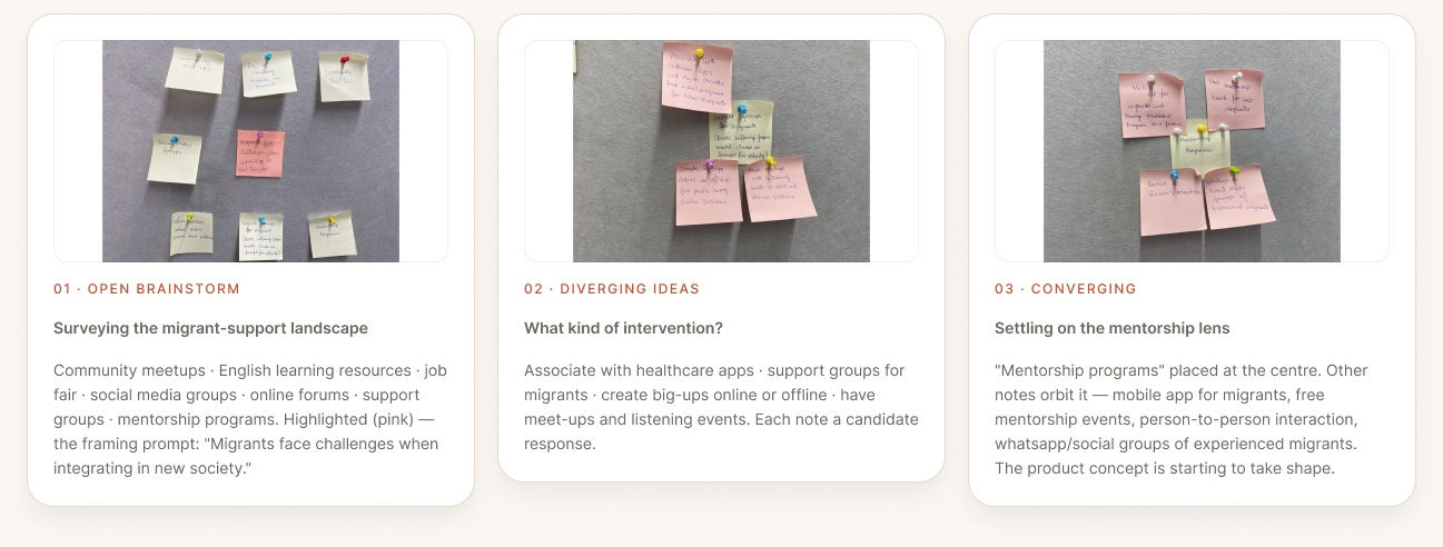
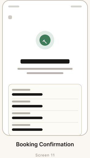
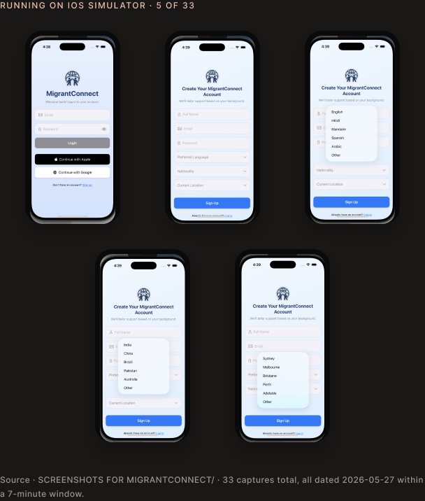
Phase 2 is the differentiator: 53 Swift files across 8 modules, MapKit and PhotosUI integrations, 33 simulator captures, and a 1:48 demo video. This section moves earlier because it proves the work is not just polished screens.
4 Swift
AppEntry & global state
Appstate · Migrant_connectApp · RootView · user
5 Swift
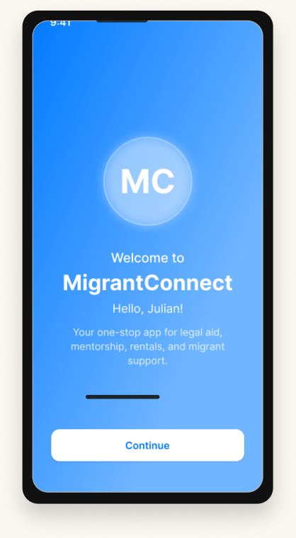
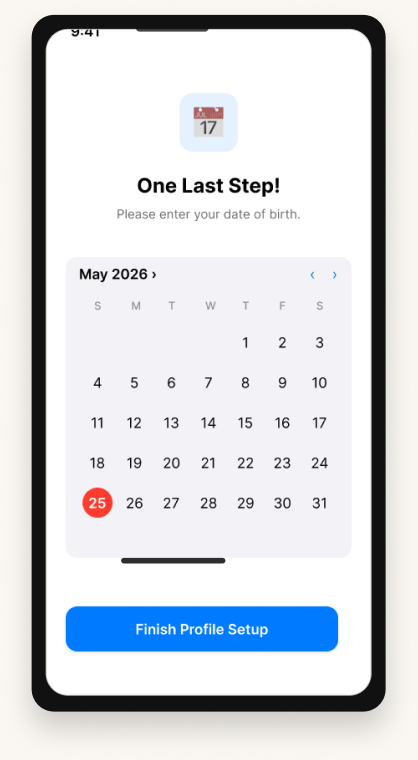
OnBoarding
welcomeview · Loginview · Signupview · ProfileSetup · colour+hex
4 Swift
Navigation & tabs
Tab structure · Home · More tab
15 Swift · largest
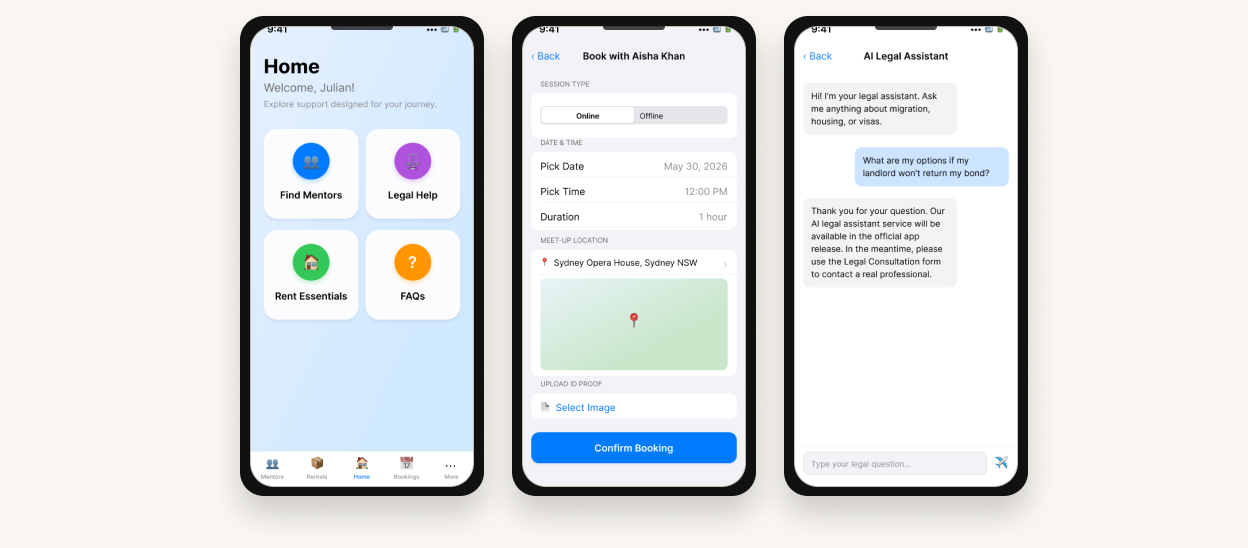
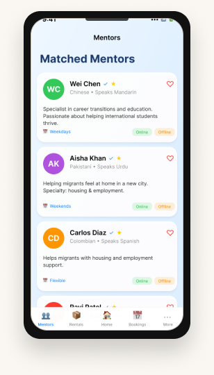
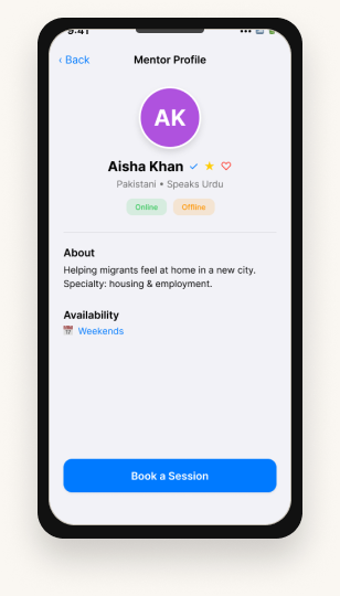
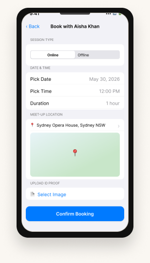
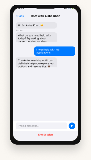
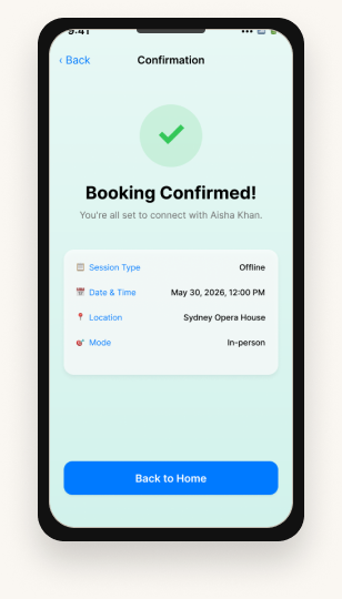
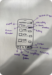
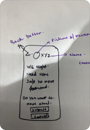
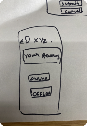
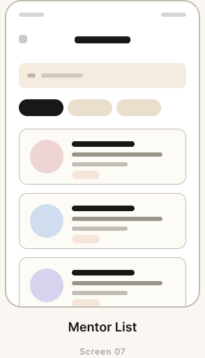
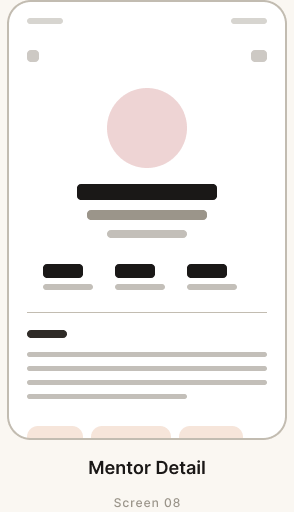
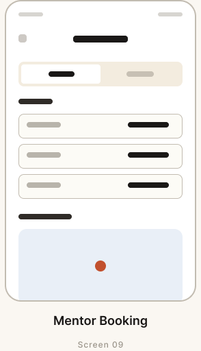
Mentorship
MentorList · Detail · Booking · Chat · Feedback · MapPin · MapKit
12 Swift
Essential Rentals
Housing · Vehicles · Tech · Detail · Booking · Manager
6 Swift
Inbox Messaging
Inbox · Message detail · message bubbles
3 Swift
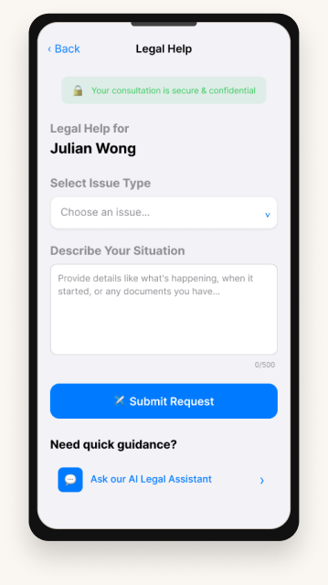
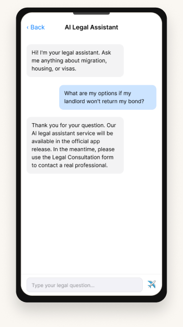
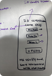
Legal Consultation
Consultation · AI Assistant · Request detail
4 Swift
Placeholder Pages
Account · Edit Profile · FAQ · Search
 01 · Figma prototype
Open the live Figma file
All 31 designed screens, design-system boards, and prototyping connections are in the live Figma file. Click through onboarding → mentor flow → rentals → legal → inbox → settings.
figma.com/design/wNhroeTnMifzvzGxUHAOzv
Open Figma →
 02 · Demo video (1:48)
Watch the running iOS app
A 1 min 48 sec walkthrough of the SwiftUI app running on the iOS Simulator. Captured in the same 7-minute window as the 33 simulator screenshots above.
Abhay App video.mp4 · 159 MB
Watch · 1:48
 03 · Xcode / SwiftUI
Run the source yourself
53 Swift files across 8 modules · MapKit + PhotosUI · SwiftUI views. Open in Xcode 15+ and run on iOS Simulator (iPhone 14 Pro / 15 Pro). 33 captures above are from this exact build.
github.com/abhay/MigrantConnect
View on GitHub →
Repo link coming soon.