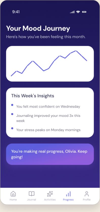
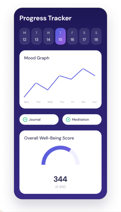
Case study · WellAI · responsible wellbeing iOS concept

WellAI

Calm mental-wellbeing support for work stress.

A Lean UX case study translating interview synthesis, affinity themes, and Olivia Banks’ persona into low-pressure check-ins, journaling, meditation, and progress tracking.

WellAI Welcome screen
WellAI Begin Check-In screen
WellAI Progress Tracker screen
Project overview

A research-led wellbeing concept, end-to-end.

Problem

A busy health-services manager feels emotionally off-balance from sustained work stress and needs a calmer way to check in with herself.
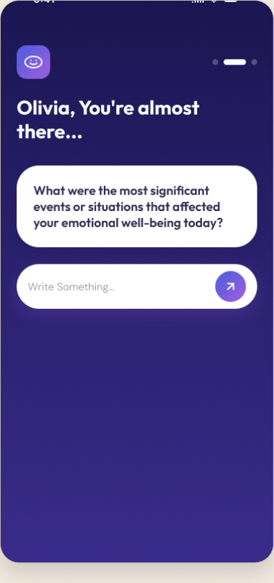
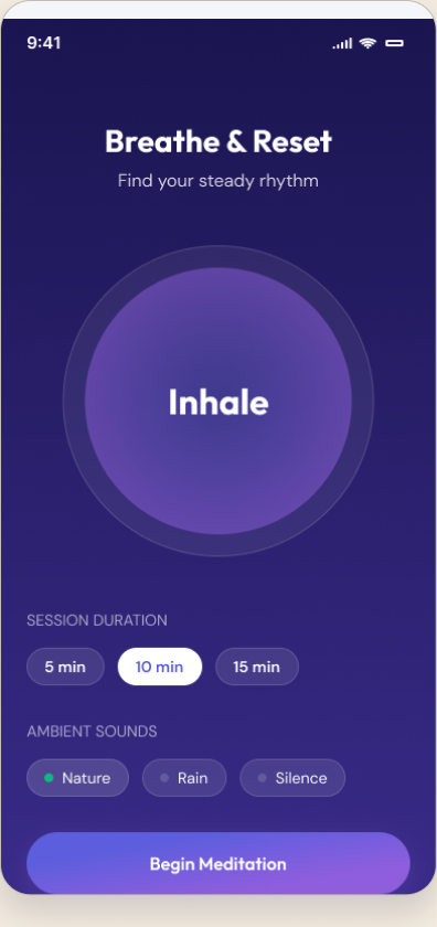
Product idea

An iOS wellbeing app for emotional check-ins, journaling, guided meditation, and progress tracking.
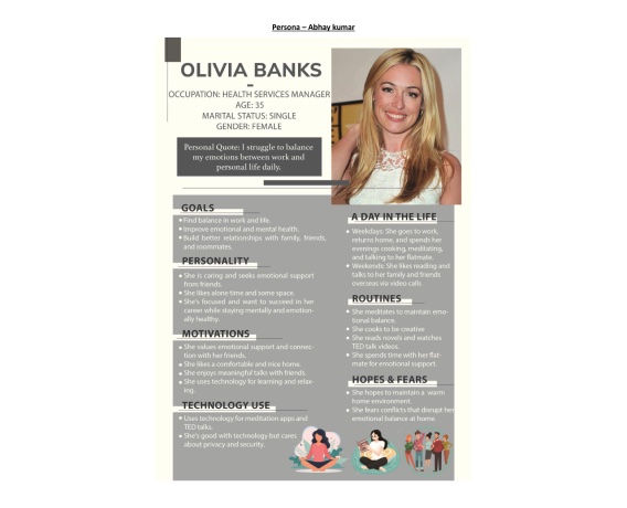
Target user

Working professionals managing daily stress — represented by the persona Olivia Banks, 35.

My role

Solo — UX research, interaction design, UI design, usability testing. (FID coursework, 2023.)

Tools

Figma · Photoshop · Lean UX methods · Nielsen heuristic evaluation.
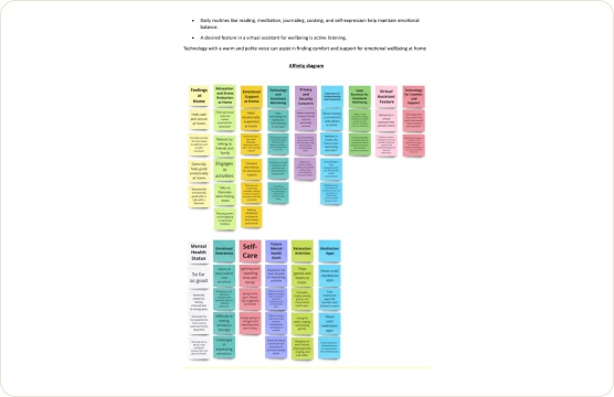
Output

Persona, affinity synthesis, problem framing, user flow, hi-fi iOS prototype, usability evaluation.

The problem

Work stress that follows you home.

Olivia manages health services and lives far from family in a foreign country. Her demanding job leaves her emotionally off-balance — and even with free time after work, the stress lingers at home, making it hard to relax, reflect, or feel in control of her own wellbeing.

Sourced from the WellAI problem scenario (FID Usability Report, 2023). No invented statistics.

Problem statement

“How might we help a working professional notice, process, and ease daily emotional stress — without it feeling clinical or like one more task on the list?”

Research process

Research evidence, not decoration.

The case study uses the original interview summary and affinity synthesis as proof of process, then connects those findings to the persona and interface decisions below.

Interview summary

What the conversations surfaced

interview_summary.png · 2023
WellAI interview summary — transcript and synthesis
Real artefact · interview synthesis
Affinity synthesis

Clustering findings into themes

affinity_map.png · 2023
WellAI affinity map — findings clustered into themes
Real artefact · affinity map
Persona

Olivia Banks anchors the product decisions.

Olivia Banks persona artefact
Original persona artefact (2023)

Olivia Banks

35 · Health Services Manager · away from family support

Goals
  • Balance a demanding job with personal wellbeing.
  • Grow personally and protect relationships with friends and family.
Pain points
  • Work stress lingers at home; hard to switch off.
  • Feels emotionally off-balance and tired.
  • Private by nature — prefers self-guided support over sharing.
Needs
  • A low-pressure way to check in on her emotions.
  • Calm, guided moments to reset during the day.
  • A sense of progress over time.

Original persona artefact retained for evidence. Refined card re-typeset for portfolio readability — content unchanged.

From research to opportunity

Three insights that shaped the product.

01Insight

Stress lingers after work — the moment of need is during the day, not in a scheduled session.

Design opportunity

Make emotional check-ins quick and always one tap away.

02Insight

She’s private — she’d rather self-reflect than share publicly.

Design opportunity

Prioritise journaling and personal tracking over social features.

03Insight

She wants to feel progress, not just complete tasks.

Design opportunity

Surface a progress tracker and Well-Being Score to make change visible.

Core user flow

One calm loop: check in, act, reflect.

The app centres on a daily loop — an emotional check-in opens the session, a supportive activity (journaling or meditation) follows, and progress tracking closes it so change feels visible over time.

Emotional check-in Mood selection Journal or meditate Progress tracker Insights over time

Flow reconstructed in Figma from the real screen set. [Reconstructed from available project artefacts]

Design decisions

From insight to interface.

Insight

Stress hits during the day, not on a schedule.

Design response

A one-tap emotional check-in as the primary entry point.

UI evidence

Begin Check-In screen

Insight

Too much content on one screen confused the test user (Nielsen: consistency).

Design response

Simplified the mood-input screen and kept patterns consistent across the app.

UI evidence

Mood selection screen

Insight

She wants to see change, not just complete tasks.

Design response

A progress tracker with a mood graph and Overall Well-Being Score.

UI evidence

Progress Tracker screen

Design responses map to real Nielsen heuristic findings from the 2023 usability evaluation.

High-fidelity UI

The interface system.

A calm deep-indigo system with lavender accents, generous spacing, and soft cards — six key screens across the check-in, activity, and tracking flows.

WellAI Welcome screenWelcome
WellAI Begin Check-In screenBegin Check-In
WellAI Journaling prompt screenJournaling prompt
WellAI Breathe & Reset screenBreathe & Reset
WellAI Progress Tracker screenProgress Tracker
WellAI History & Insights screenHistory & Insights
WellAI Progress Tracker screen, annotated
Annotated · Progress Tracker

Where research becomes interface.

  • 1

    Mood graph over the week — answers Olivia’s need to notice patterns, not just log a moment.

  • 2

    Journal + Meditation completion chips — make the daily loop feel finished without pressure.

  • 3

    Overall Well-Being Score — the single ‘am I improving?’ signal she asked for. Makes change visible.

Usability testing

Testing revealed one fix and two decisions to keep.

A participant reviewed seven screens using Nielsen’s heuristics. The useful portfolio story is not a score — it is what changed after the violation, and what stayed because it worked.

V · Violated

Consistency & standards

Mood-input screen (#5)

Too much content on one screen — and it looked and behaved differently from the rest of the app.

What I changed / kept

Simplified the mood-input layout and brought it back in line with the app’s shared patterns.

C · Complied

User control & freedom

Mood-input screen (#5)

The participant could easily choose a mood type and felt in control of the selection.

What I changed / kept

Kept the mood picker open and low-commitment — no forced paths.

C · Complied

Visibility of system status

Journaling & tracker (#2, #8)

The participant understood that typing led to the next step, and located the mood tracker without help.

What I changed / kept

Kept clear forward affordances and a discoverable tracker entry point.

Findings are from the 2023 FID Usability Report: Nielsen heuristic evaluation, seven screens, one participant — no quantitative claims.

Prototype & outcome

A working high-fidelity Figma prototype — tested with a real user.

The concept was prototyped in Figma and evaluated in a usability session using Nielsen’s heuristics across seven screens. Findings led to clearer mood-input and more consistent patterns. The output is a high-fidelity concept prototype — not a shipped product, and with no real-world usage metrics claimed.

Live prototype

Open the WellAI Figma prototype

Click through the full check-in → activity → progress experience.

Open Figma →
What I’d test next

Validate the daily loop

Test whether the one-tap check-in actually fits into a stressful workday, and whether the well-being score motivates return visits.

Reflection

Designing for emotion, responsibly.

WellAI taught me to translate a real person’s emotional needs into restrained interface decisions: a check-in that doesn’t demand much, journaling that respects privacy, and progress that motivates without pressure. Working from interview to affinity synthesis to persona to usability testing made the design decisions defensible — each screen traces back to a research finding, not a guess.