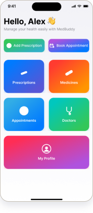
Health records, organised — designed and built.
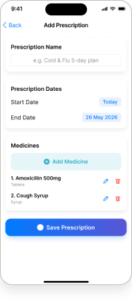
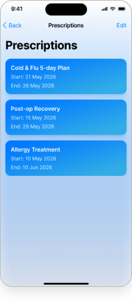
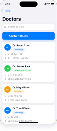
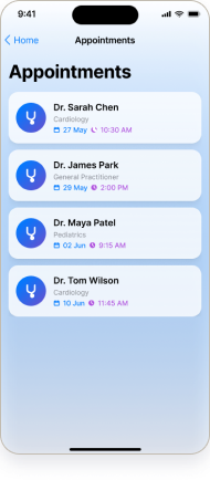
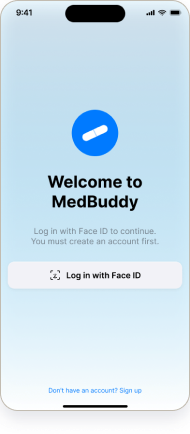
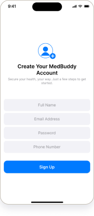
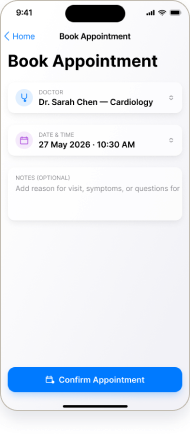
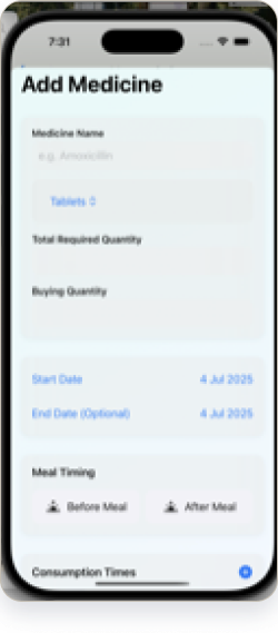
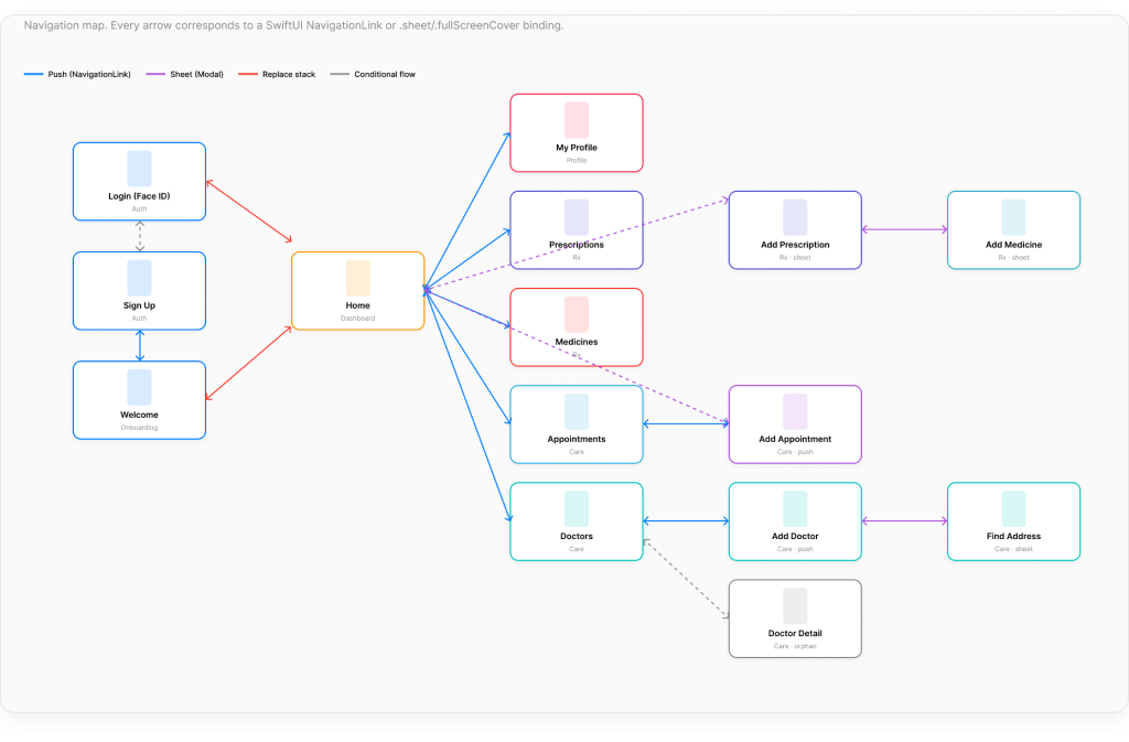
An iOS app for prescriptions, medicines, doctors and appointments — designed in Figma, then rebuilt in SwiftUI with a real SwiftData model layer and MapKit.


The hi-fi interface — clean, form-first record-keeping for prescriptions, doctors, medicines and appointments.
Home
Prescription List
Add Prescription
Doctor List
Appointment ListAll 13 real screens from the prototype — the calm blue-and-white system across auth, home, and the four record modules.
Auth & onboarding
Login · Face ID
Sign up
WelcomeHome & profile
Home
My ProfilePrescriptions
Add Prescription
Prescription ListDoctors & medicines
Doctor List
Add Doctor
Add Medicine
Medicine ListAppointments
Add Appointment
Appointment ListDocumented from the built screens — a trust-blue accent, a clear type ramp, and a small set of components reused across all 13 screens.
Colour
Core components
Every screen I designed in Figma, I rebuilt in SwiftUI — backed by a real SwiftData model layer, not a static mockup.


@Model class Prescription: Identifiable { var id = UUID() var name: String var startDate: Date var endDate: Date var medicines: [Medicine] = [] // SwiftData relationship }
A real SwiftData @Model — a prescription owns its medicines (a one-to-many relationship), driving the @Query-backed lists.
@Model entities for Prescription, Medicine and Doctor — with relationships and @Query-driven lists that persist on device.
Views, view-models (DoctorViewModel, FindAddressViewModel) and services kept separate for a clean, testable structure.
Doctor addresses are searched and resolved with MapKit (MKLocalSearch) and shown on a map in the Add Doctor flow.
A basic local notification flags an upcoming appointment — a small but real piece of system integration.
Personal health info is scattered across notes, messages, paper and calendars — easy to lose, easy to forget.
One iOS app to keep prescriptions, medicines, doctors and appointments in a single, organised place.
Solo — UI/UX design and the full SwiftUI build.
Figma · Xcode · SwiftUI · SwiftData · MapKit.
18 Swift files · MVVM · a real SwiftData model layer + MapKit address search.
13 hi-fi screens, a working SwiftUI app, and a clickable prototype.
Prescriptions live in a drawer, the doctor’s number in messages, the next appointment in a calendar, and the medicine schedule in your head. None of it is in one place, and the gaps are exactly where things get missed.
How might we let someone keep every prescription, doctor and appointment in one calm, trustworthy place?
Designer-framed problem for this build — no field research was conducted. Honest scope.
Someone managing personal or family healthcare — prescriptions to refill, doctors to remember, medicines to track, and appointments to keep — who wants it all in one trustworthy place rather than five.
[Designer-authored user context — not user-research-derived. This project is a design + iOS-implementation showcase, not a research study.]
Four record types behind a single, calm home screen.
Short, clear add-flows for every record — minimal fields, obvious actions.
High contrast, generous tap targets and no clutter — health info you can trust at a glance.
SwiftData models so the app actually remembers what you add.
Reconstructed from the screens: sign in, land on Home, and manage four record types — each with the same add → list → detail pattern.
[Flow reconstructed in Figma from the 13 screens. The same pattern serves Prescriptions, Medicines, Doctors and Appointments.]

Exported from the MedBuddy SwiftUI build. Every arrow is a real NavigationLink, .sheet, or .fullScreenCover binding across all 15 screens — colour-coded by transition type.
The flow is clickable in Figma, and the same screens run as a real SwiftUI app on the iOS simulator. A concept build — not shipped, with no real users or usage metrics.
“Designing and building the same app taught me how a design decision actually lands in code — and which ones get expensive.”
Owning both the Figma and the SwiftUI made the data model the real design tool — a prescription that owns its medicines shaped every screen. Given more time, I’d implement real Face ID auth (it’s currently a designed screen), run usability testing, and capture more of the running app for the case study.