User Control & Freedom
The delay notification had no dismiss — users were forced to act on it.
Fix applied →Added a dismiss button to the pop-up.
Most transit apps tell you you’re late. RouteSync tells you what to do next.
A product-design case study for delay anxiety: route planning, live recovery states, a 7-scene storyboard, and a 10-participant Nielsen usability test.
Dominant hero state: Map · Delayed
The hi-fi interface — calendar-aware planning, live tracking, and a clear next move when the route changes.
Home Search
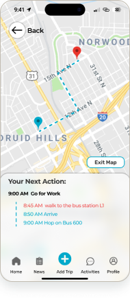 Map
Map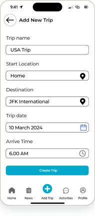 New Trip
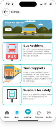 News
NewsRouteSync turns a messy commute change into one readable decision: what changed, what to do next, and how to recover without app-switching.
The key screen is not the map. It is the moment the plan breaks and the user needs a next move.
57 interaction states show product thinking beyond static UI screens.
The 10-participant evaluation turns the case study into evidence, not decoration.
Commuters juggle weather, transit, calendar, and map apps — and still get caught out when a route is delayed.
A calendar-aware companion that plans the route, watches for delays, and surfaces the next best move.
Alex — a busy Sydney professional whose workday is driven by calendar events and public transport.
I owned the UX research and evaluation — persona, storyboard, thematic analysis, and Nielsen usability testing — and built UI in Figma. (University team project.)
Figma · Miro · DALL·E (storyboard, disclosed) · Nielsen heuristic usability testing.
57 interaction states, a day-in-the-life storyboard, a 10-participant usability evaluation, and a clickable prototype.
A commuter’s day is driven by the calendar, but the tools aren’t. Weather, transit status, maps, and the schedule live in four separate apps — so when a train is delayed, the real cost is the scramble to work out the next best route, fast.
How might we give a calendar-driven commuter one calm view of their route — and a clear next move when it’s delayed?
Framed from the team’s RouteSync evaluation report (UTS Advanced Interaction Design, 2024). No invented statistics.
It designs the recovery moment: what changed, what to do next, and how to stay on time without app-hopping.
I built the persona from the interviews and thematic analysis. Alex anchored every design and evaluation decision.
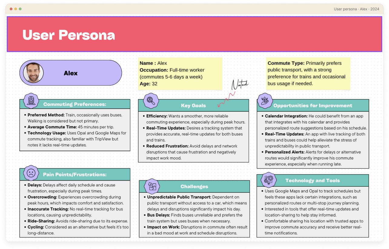
32 · Full-time worker · Train commuter · Sydney
[Persona is a real project artefact (Miro). The refined card below is re-typeset for this portfolio — content unchanged.]
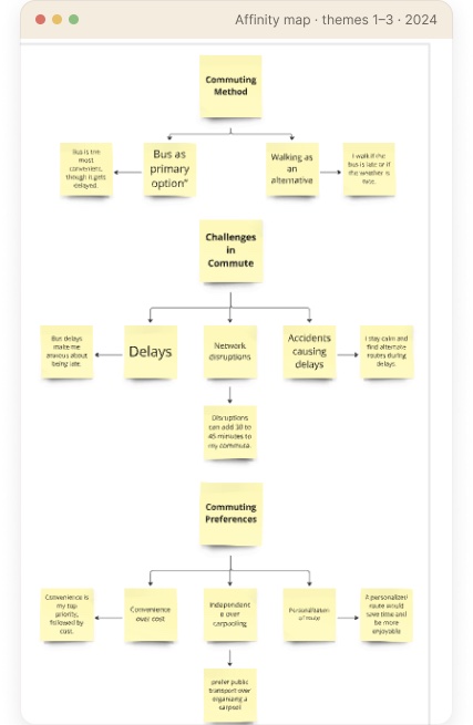
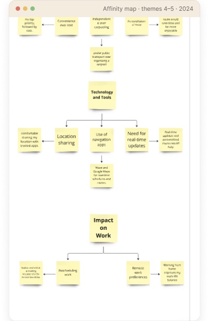
I interviewed commuters, then ran a thematic analysis in Miro — clustering what I heard into the themes that drove both the design and the usability evaluation.
By the numbers
Open questions on real commutes.
Notes clustered in Miro into themes.
Themes distilled into Alex.
Heuristic usability testing.
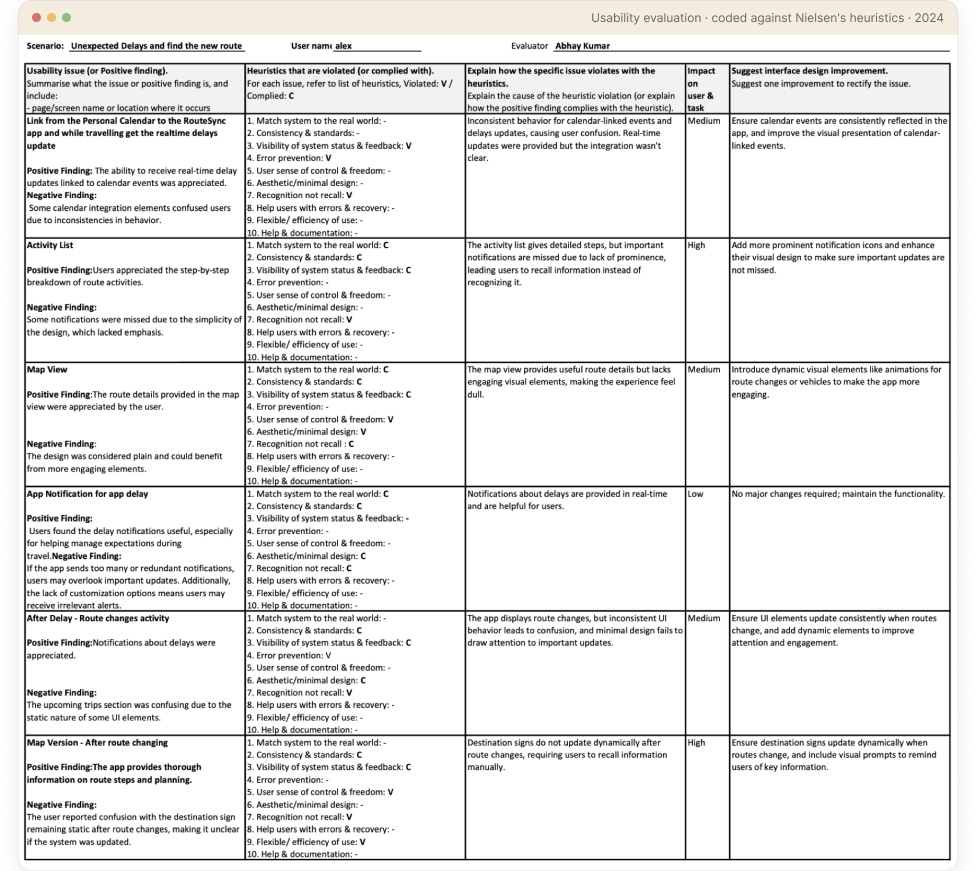
I then coded each usability session against Nielsen’s heuristics — task, violation, severity, and the fix:
Themes that surfaced from the affinity map — in commuters’ own words:
“Bus delays make me anxious about being late.”
“I stay calm and find alternate routes during delays.”
“Real-time updates and personalised routes would help.”
“Convenience is my top priority, followed by cost.”
Verbatim notes from the interviews, clustered in my affinity analysis. No invented quotes.
Delays make commuters anxious — but they stay calm when they can quickly find an alternate route. The next move matters more than the delay.
People already lean on live maps; they want updates and alternatives tied to their exact route, not generic transit news.
Convenience and a personalised route beat cost. The commute should plan itself around what’s next on the schedule.
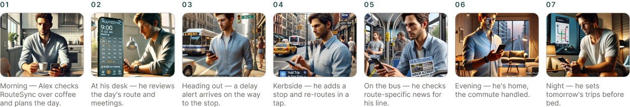
Storyboard scenes generated with DALL·E for ideation (disclosed). The sequence and narrative are my own.
Surface the next action and keep the rest out of the way.
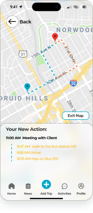
When plans change, the alternative is one tap away — never a dead end.
Calendar, route, live status, and news in a single, coherent flow.
Alternate route, inline
The new route appears in context — no separate search, and never a dead end.
‘Your New Action’ summary
Plain-language next steps with times: walk to the stop, arrive, hop on.
Stay in control
Exit Map keeps the original plan visible — the user decides, the app doesn’t force it.
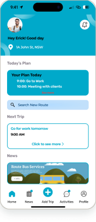
Trips seed from the schedule — the home plan and calendar start the route for you.
Seen in: Home
News and alerts are scoped to the active route, not a generic transit feed.
Seen in: News
Reconstructed from the prototype: the calendar seeds a trip, the trip is tracked live, and when a delay hits, the app routes the user to the next best option.
[Flow reconstructed in Figma from the prototype — RouteSync, AID 2024.]
Before the hi-fi UI, I mapped the journey and blocked out every screen as low-fidelity wireframes — proving the structure before the polish.
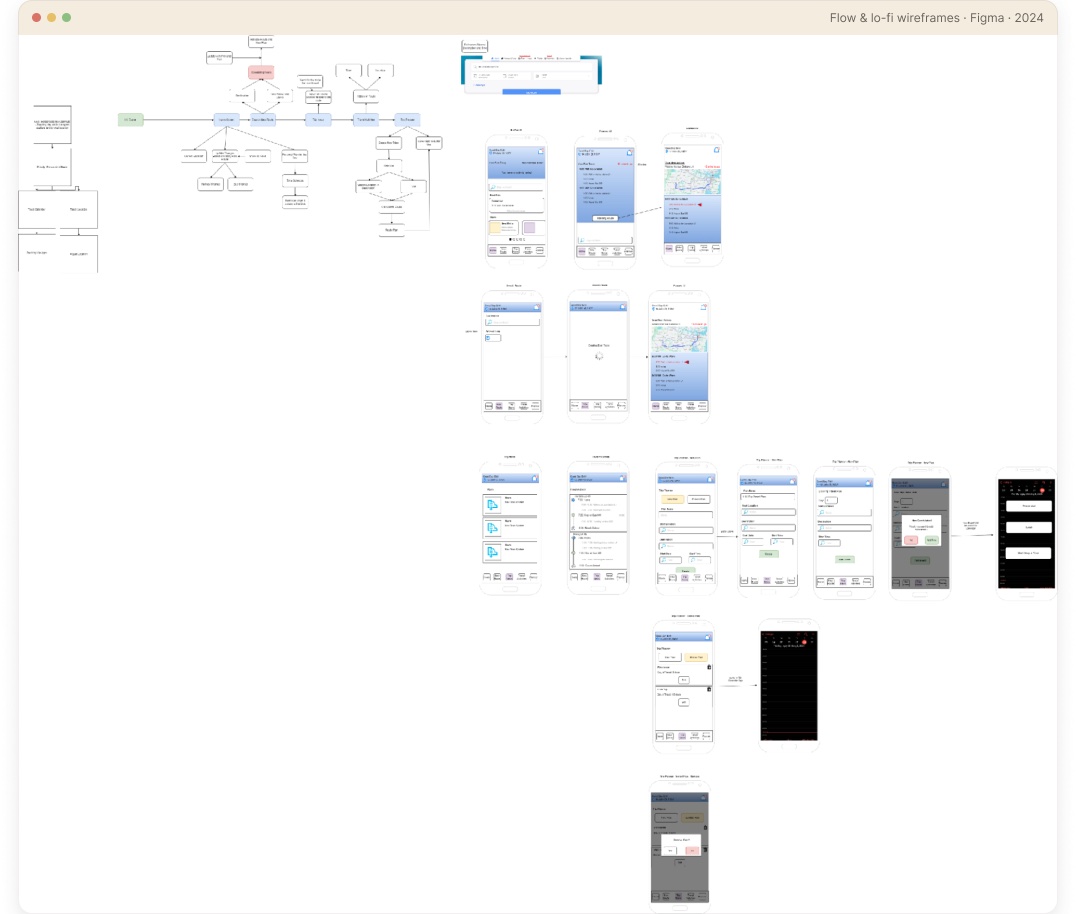
Documented from the shipped screen library — one accent, a clear type ramp, and a handful of components reused across all 57 screens.
Colour
Core components
Real screens from the 57-state prototype — a calm cyan system, calendar-aware planning, and clear delay handling at every step.
Plan the day
Home CalendarSearch route
Track & recover
Map viewTrack routeMap · Delayed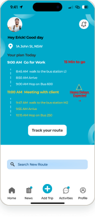 Track · Delayed
Trips & updates
New Trip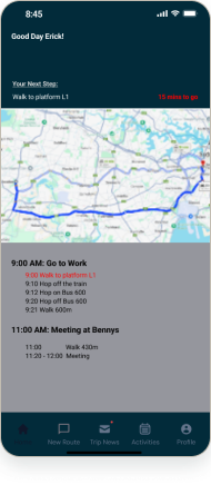 Trip View
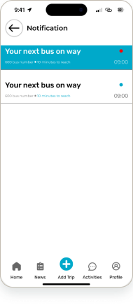 NotificationNews
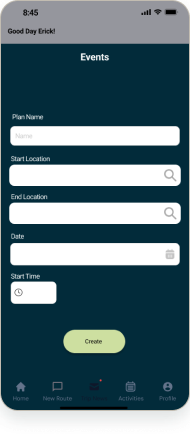 Events
A commute isn’t one screen — it’s a system of states. I designed the loading sequence and the delay-recovery states so the app stays calm and clear even when the transit network isn’t.
Loading sequence · 7 frames
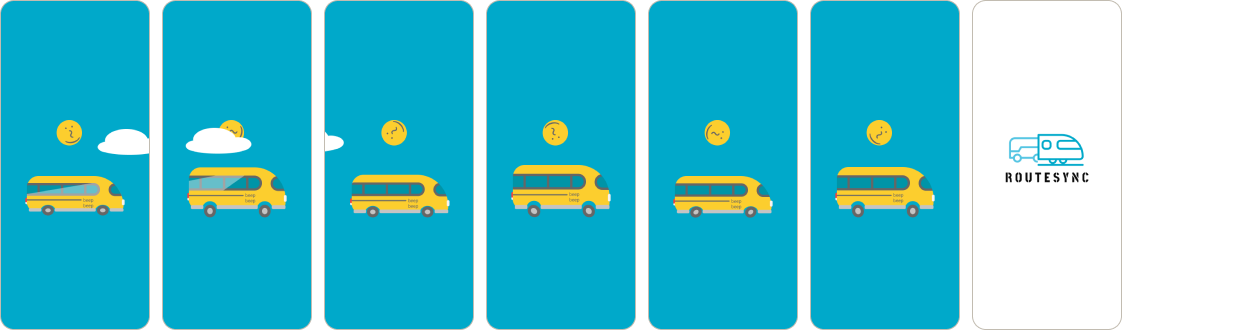
7-frame loading animation — view it live in the prototype →
Delay-recovery states
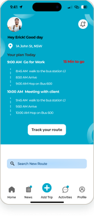
Map · Delayed
The map surfaces the alternate route inline, with the next action spelled out.
Track · Delayed
Live tracking flags the delay and re-times each leg so the user can adapt.
The full flow is clickable in Figma — plan from the calendar, track live, hit a delay, and recover with an alternate route. A high-fidelity concept prototype, not a shipped product.
The 10-participant evaluation pinpointed exactly where the prototype broke down. Each finding mapped to a Nielsen heuristic — and to a concrete fix.
The delay notification had no dismiss — users were forced to act on it.
Fix applied →Added a dismiss button to the pop-up.
The ‘Heavy Delays Expected’ button was easy to miss, so users couldn’t find the reroute.
Fix applied →Enlarged the delays button and raised its prominence.
The new suggested route was hard to tell apart from the original trip.
Fix applied →Recoloured the new-route changes so they stand out.
No confirmation that a new trip had been created.
Fix applied →Added a confirmation screen on trip creation.
From the team’s 10-participant Nielsen usability evaluation (AID 2024). Real findings, real fixes — full coded sheet shown in the research section.
Every major usability issue from testing was fixed before final hand-off.
“The screens people remember aren’t the happy path — they’re the moment something breaks, and the app still has their back.”
Designing RouteSync taught me to treat states — loading, delay, recovery — as first-class screens, not afterthoughts. Testing with 10 users showed how small visibility issues (a hidden delays button, an unconfirmed action) quietly erode trust. Given more time, I’d run a second round on the reroute flow and validate the alternate-route logic with live transit data.